LIFENET Care is a web and mobile application designed to enable pre-hospital and hospital care teams to communicate more effectively.
ROLE
Solo designer, lead usability researcher, driver of project schedule, design system development
TEAM
Interaction design (me), marketing, systems engineering, software engineering, project management.
DURATION
10 months to MVP launch
CUSTOMER PROBLEM
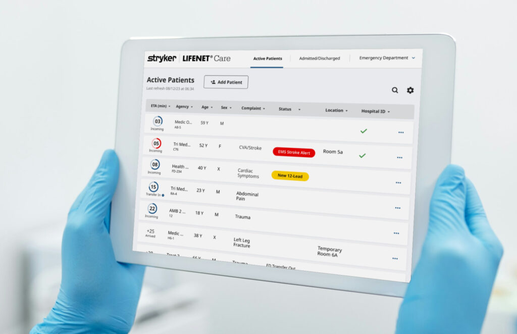
Busy health care providers have too many software products that manage patient data in the hospital. None of the platforms share data, and therefore they have to double document their daily tasks, or keep many browser tabs open, and flip between them in order to find scattered pieces of information across multiple systems.
Hospital users are looking for a way to speed up treatment time when patients come into the emergency department, receive clear and traceable communication between care teams, and consolidate their platforms.
EMS users are interested in communicating in modern ways to the care team at the hospital. The more data they can send, the easier the hand-off will be when they arrive at the hospital.
PROCESS
The marketing team spent 8 weeks conducting 43 global interviews to help us understand what problem we should solve in the software space encompassing both EMS and Hospital.
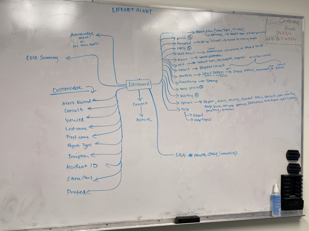
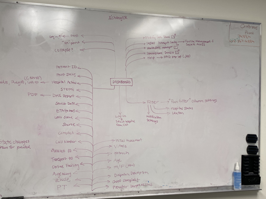
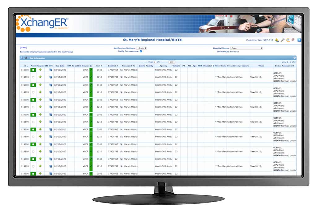
We found that the biggest pain point was during patient hand-off. There is an industry gap with knowledge sharing and data transfer between care teams that we decided we would solve. After our marketing teams began to understand more about our future products problem space, we hit the ground running with just enough information to kick start work. The systems engineering team began to draft product requirements while interaction design started to understand site hierarchy of our existing platforms and develop design pillars to guide us as our north star.
DESIGN PILLARS
Streamline the patient journey by creating a seamless hand-off between pre-hospital and hospital team
Serve actionable data at key moments in users workflow
Optimize for emergent patients such as STEMI, Stroke and Sepsis, but accommodate non-emergent types.
Configurable solution to meet a wide range of unique system needs.
Create a product that can evolve to meet future user needs. Foresight was key!
JOURNEY MAP
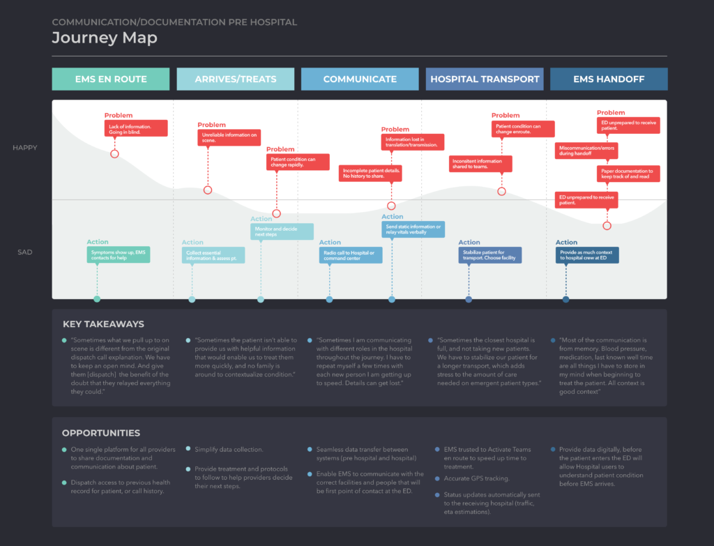
During preliminary research, we learned that patient condition and context was a crucial area to better understand. Both of these are major factors in decision making for both pre-hospital and hospital care teams.
We focused on the pre-hospital patient and EMS journey to better understand where the context of our communications between teams broke down. This exercise revealed that the biggest pain points happened during communication phases, and EMS handoff to hospital (which is also a form of communication).
UNDERSTAND
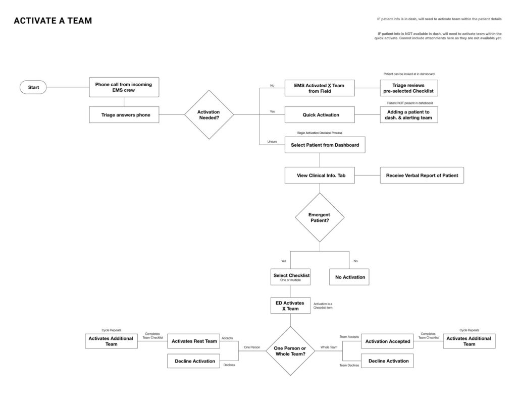
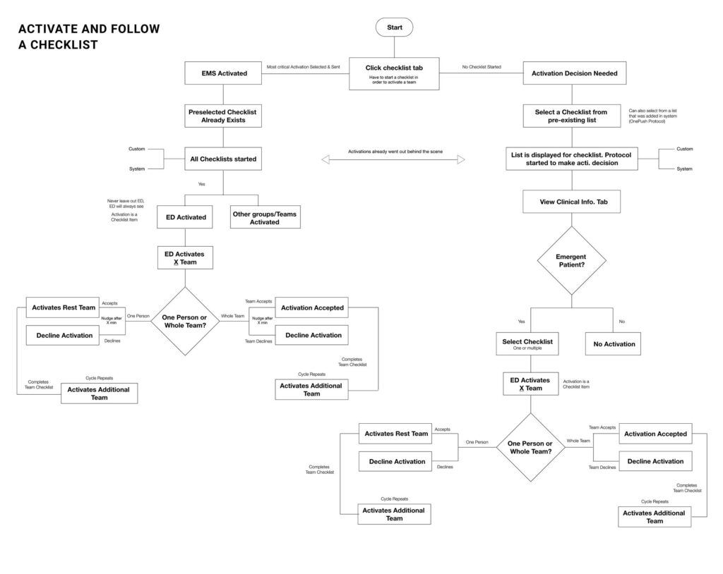
Before kicking off design solutions, there was still a bit more understanding of our problem space left to explore. It was imperative to understand the primary actions that our hospital users take after receiving a patient from EMS, and how EMS’s documentation, communication, and protocols informed the hospitals next steps.
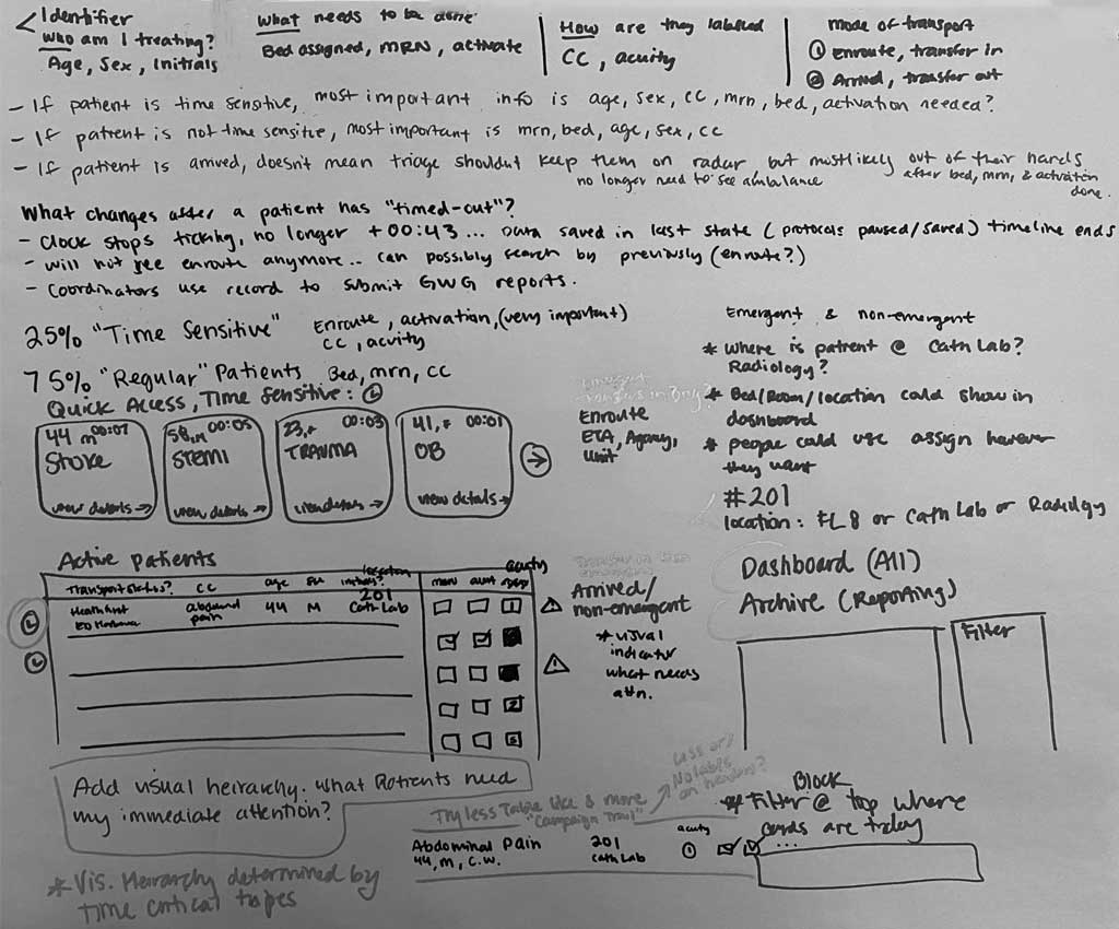
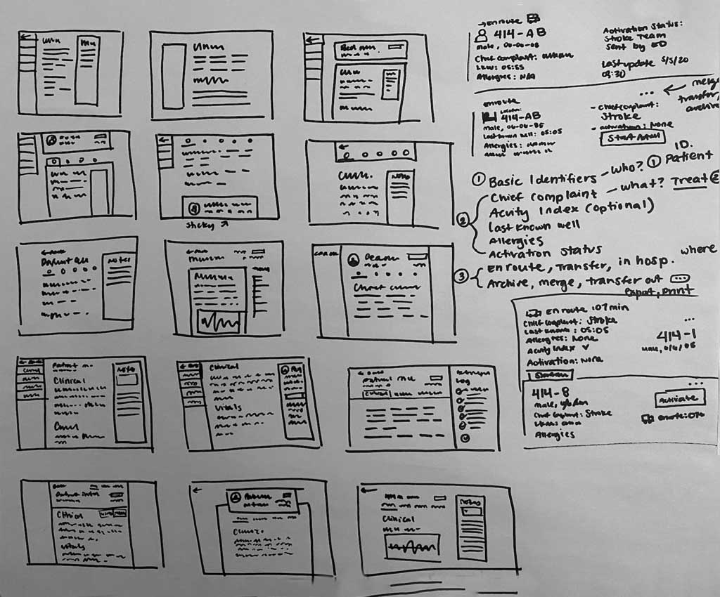
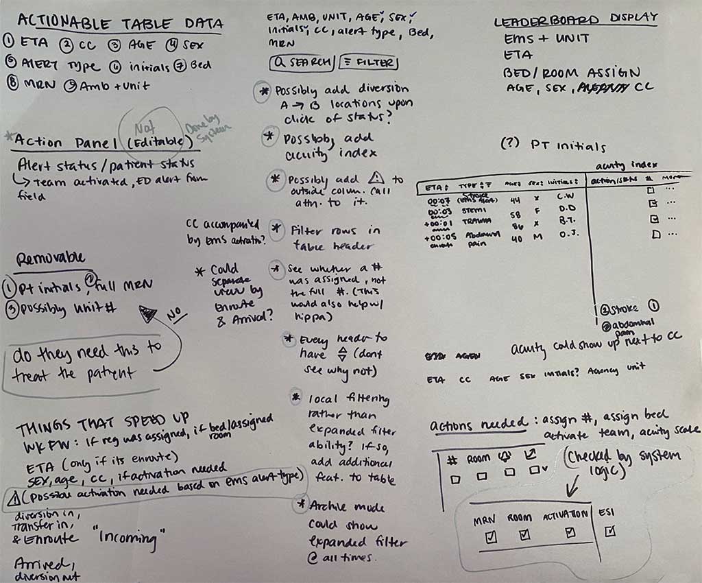
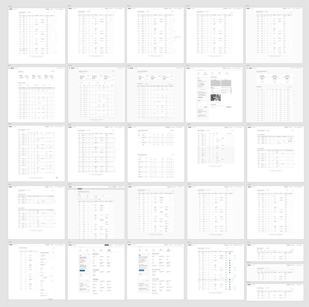
BEGIN CONCEPT EXPLORATION
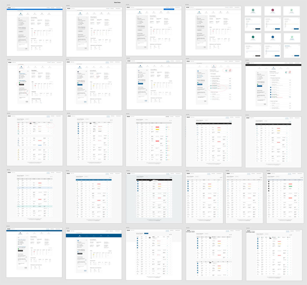
CUSTOMER DISCOVERY
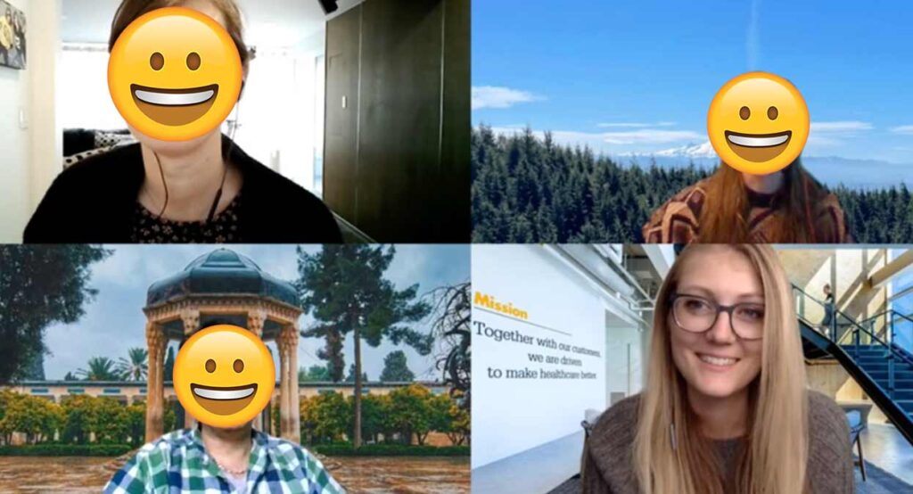
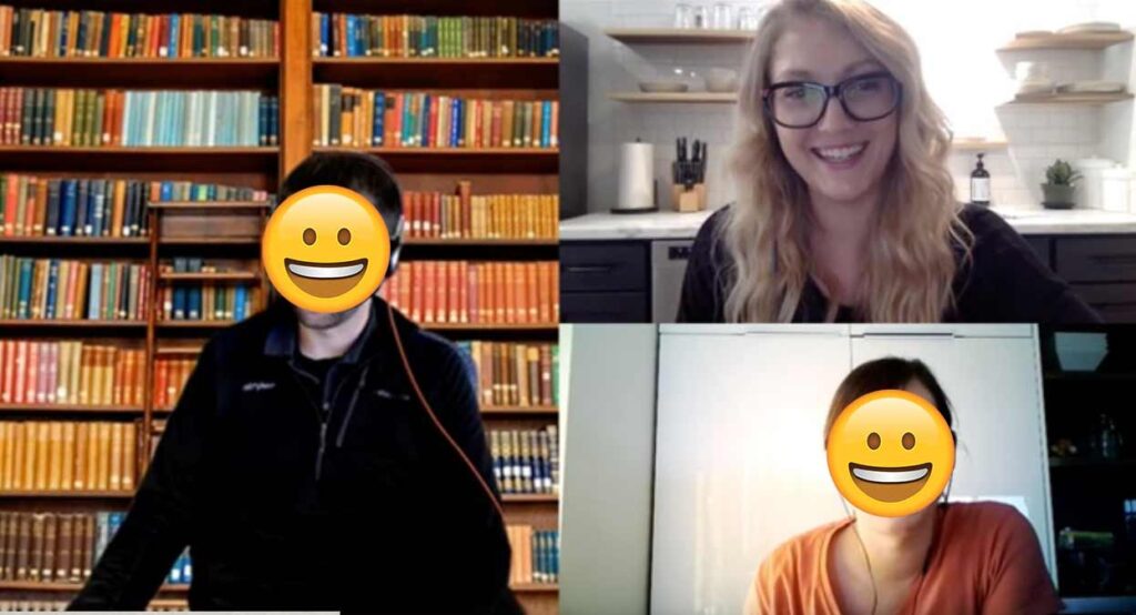
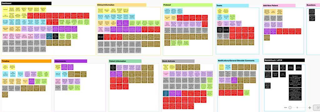
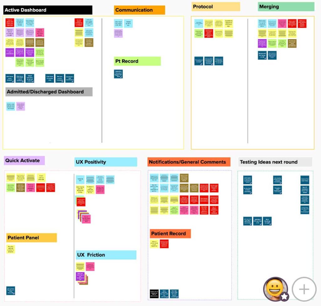
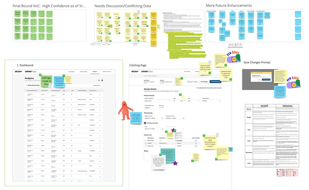
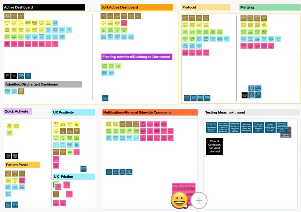
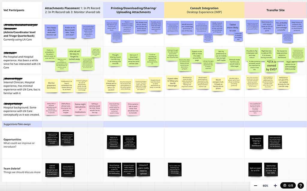
Design and Marketing facilitated 6 rounds of usability testing over the course of 3 months. Due to the nature of remote testing during peak COVID, all testing occurred virtually, with users primarily sourced from our clinical advisory network. With each study, the fidelity of the digital prototypes and interactions increased.
Design lead and constructed protocols to be used in each study. Marketing supported the creation of our scenarios, note taking, and distillation, as well as asking more technical follow up questions at the end of each session.

MY BIG BET: OVERHAUL THE UX
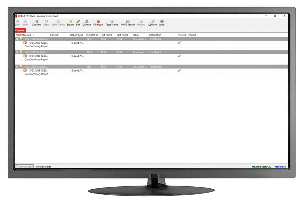
After a few rounds of testing our oldest concepts, I noticed that the basic flow of our application had some inefficiencies. Users were getting confused while navigating around the patient record and “stuck” on what the icons meant.
When I inherited the design, it looked like this >>>
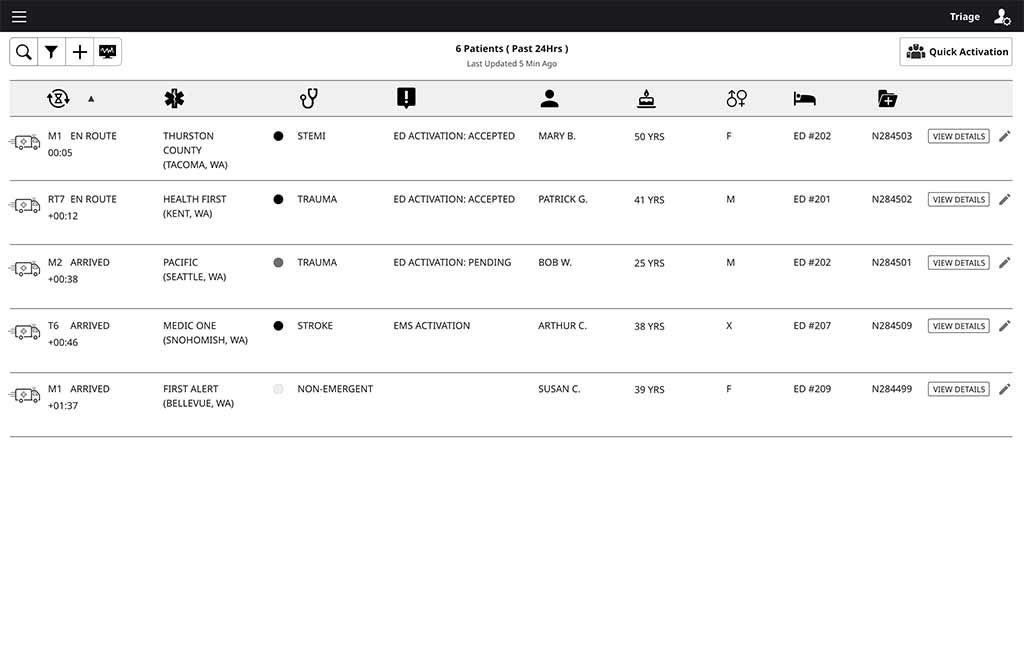
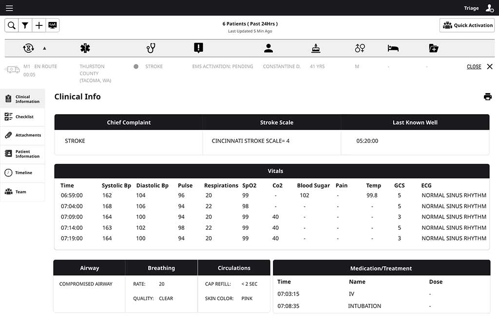
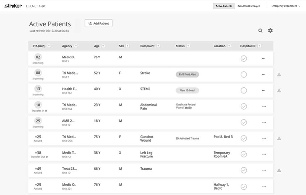
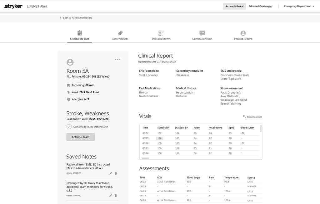
Round 3 usability testing marked the biggest UX change I made to the product.
I separated the dashboard from the interior patient record pages, and added labels to the iconography.
We tested similar tasks as the first two rounds of research in order to measure success within the same workflows in the new navigation.
ROUND 3 RESULTS
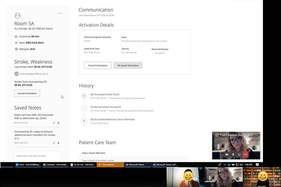
Round 3 research yielded encouraging results:
- 15 task based scenarios with each user (Total 5 users)
- 67/75 tasks completed effortlessly = 90% succes rate
- 1/5 users were a first time user (which did not appear to effect results negatively)
8 points of friction out of 75 observed interactions:
- 4/8 were the same repeated interaction on a non-critical task.
- 2/8 were repeated on a different, non-critical task.
- 2/8 were miscellaneous user errors, but all within non-critical scenario steps.
CUSTOMER QUOTES
“I like this better, much more actionable. I am not having to scroll like expanding the view. The data needs to be actionable, and if I need to I can expand.”
“Very simple, cleaner. Ease of use is a 1 or 2. The old product is so dated. In this setting, a lot of colors is not what you need.”
“Too easy, perfect! We had to do more steps previously. I like this one button and done.”
“I like this, this is different than before. I am really sure [the task] is done, and I’m not disoriented. This is super simple.”
“To have a visual long before EMS shows their faces is so exciting. We used to hand write everything out. I wish I had this in the ED.”
PROJECT CONSTRAINTS
Speed to market, limited resources, complicated architecture, and a ground up build are just a the few of the obstacles we faced in taking on this project. This project was one of the hardest, most time-constrained designs I have created. It was such a positive challenge to make fast, intentional decisions, and advocate for our user experience to a team who was new to working with a dedicated data solutions product designer.
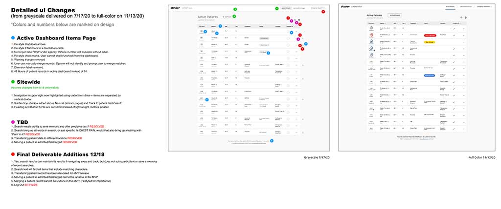
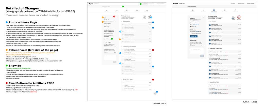
One of the main ways I helped speed up execution time was close collaboration with our developers. I strategized to deliver a full site prototype in medium fidelity that they could start coding while Marketing and Design wrapped up final usability studies in high fidelity. This meant that I delivered our files in waves, and documented the changes between what was delivered early, and what was delivered a few weeks later (as final) so that they could easily spot the differences. Our team responded well to this approach, and appreciated the extra time it took me to document the change history.
PRODUCT BRAND LANGUAGE
I was the first designer hired in the Data Solutions Portfolio, and therefore tasked with translating Strykers existing brand language into our software products. I focussed on a few key areas, and pulled from existing device form/function language to inspire the digital ecosystem we created.
Harmonization.
Ease of use and visual beauty.
Assurance.
Invite confident interactions.
Enticing.
Invitation to engage with at first glance.
Humanizing.
Accelerated Curves.
Unique Experience.
Aesthetics that promise a special interaction.
Layered Surfaces.
Depth and Interest.
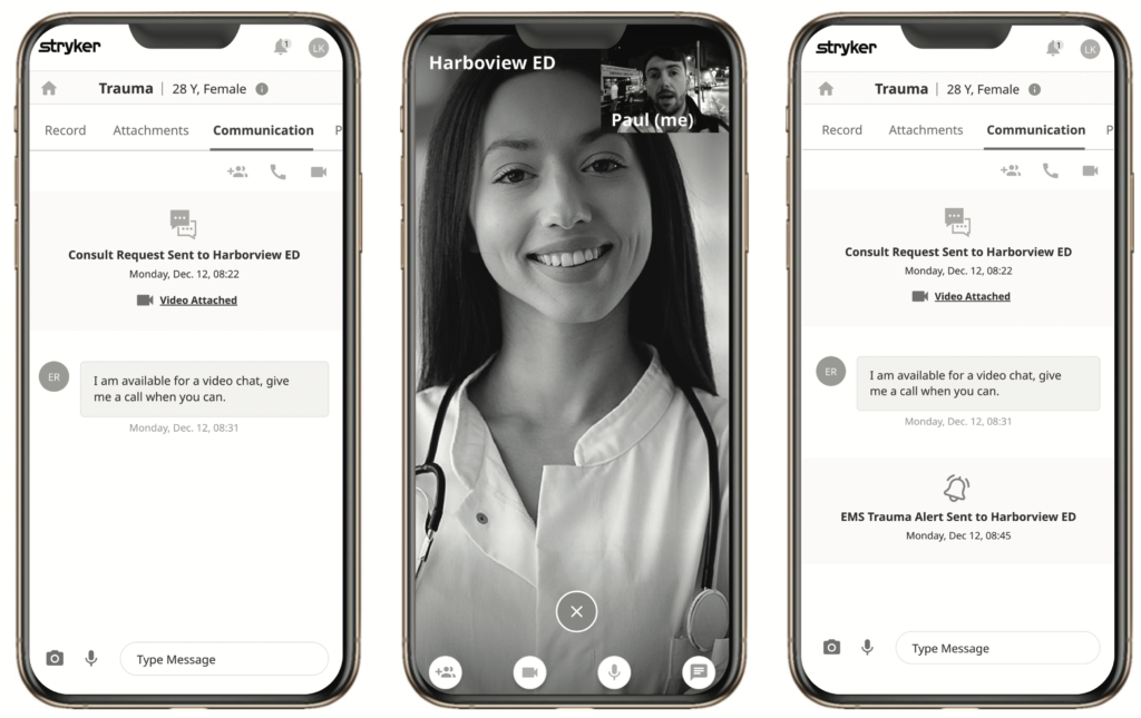
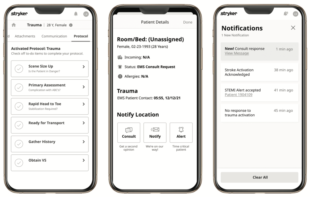
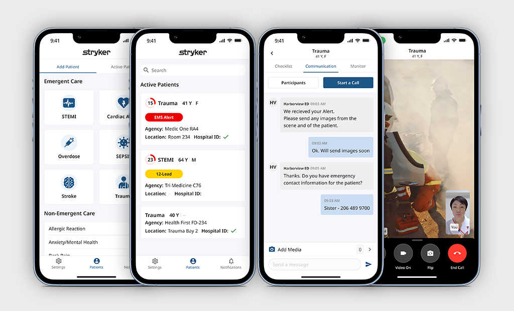
MOBILE APPLICATION
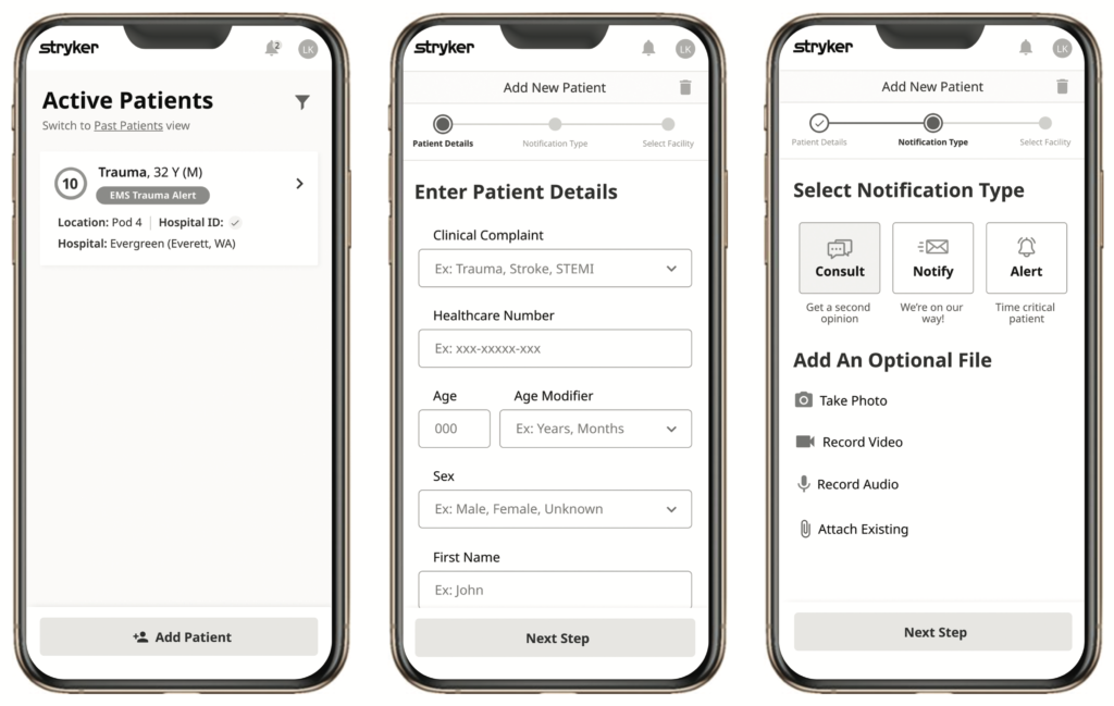
I began designing the mobile app experience while the desktop experience was being developed. After launch of the web application in early 2021, the business saw how valuable interaction design was to our customer experience after early positive feedback, and we were granted the ability to hire another designer. I recommended a designer within my network, and he was hired shortly after to take on the challenge of extending our brand elements and finalize the app design. He lead the final design, with my support when needed.
OUTCOME
After LIFENET Care was launched, the Data Solutions product sales increased by 27% in the first year.
- Facilitated 67 customer interviews (on Care platforms to date)
- Tested and launched 3 new environments interfacing with web client (desktop client for notifications, analytics for post incident data, and portal for settings/configurations)
- In 2023, 127 enhancements were made to these 3 product lines alone- all designed by only 2 designers.
The mobile application was developed one year after our desktop experience and continues to grow with quarterly release cycles adding continual value to our emergency care users, and extend reach into the market.
Here are some of the area’s I expanded my experience in while designing this product:
- Foresight. It is hard to know exactly what the future might hold for this product, but I knew early on that the design needed to be scalable. I built the architecture in such as way that could still look great and function a variety of data quantities in real time, as well as custom configurations our customers would have in the future.
- Marketing and Design Collaboration. I worked very closely with Marketing on this product, and split many of the usability sessions into two parts: 1. User-lead research facilitated by design (me) 2. Follow up technical questions. With each session I gained an even better understanding of our unique product needs and the problem space of our users.
- Design to Drive Schedule. We were between Product Managers when this project kicked off, so I created a schedule that the team could march toward. This included a multi-part delivery strategy when delivering our developers waves of design work as it increased in fidelity and finality.

